
Dikalo Logo

Logo Orange

Logo Light

Logo Dark
Using the Dikalo logo
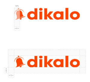
Minimum free space
You must always keep free space without images or text around the Dikalo logo. To calculate the minimum free space around the logo, use half the width of the icon.
If text appears under the logo, you must keep a minimum free space between the bottom of the logo and the x height of the text.

Uses of the logo to avoid
The Dikalo logo is a symbol that people recognize. It must never be altered.
Here are some examples of using the Dikalo logo to avoid.
To avoid
- Change the spacing between the icon and the word “dikalo” or its letters
- Use different colors of orange, dark and white
- Choose another font for “dikalo”
- Add visual effects as a projected shadow
- Change or replace the word “dikalo”
- Change the shape of the logo
- Use the logo in an expression or phrase

Using the logo on the plain backgrounds
These examples show how to use the Dikalo logo on plain backgrounds.

Monochrome logo
If the background color makes the color logo difficult to see, please use the monochrome logo instead.
The almost black monochrome logo (#282828) should be used on clear multicolored images.
The white monochrome logo (#FFFFFF) should be used on dark multicolored images.


The colors of Dikalo
Orange
#FF4400
RGB: 255.68.0
White
#FFFFFF
RGB: 255.255.255
Almost black
#282828
RGB: 40.40.40
Whenever you want to use an element of the Dikalo brand, you must obtain a special authorization by sending the request form for use of the brand. We reserve the right to object to any improper use of our brands and to exercise our rights at any time.

